The Problem With My Magic Mouse
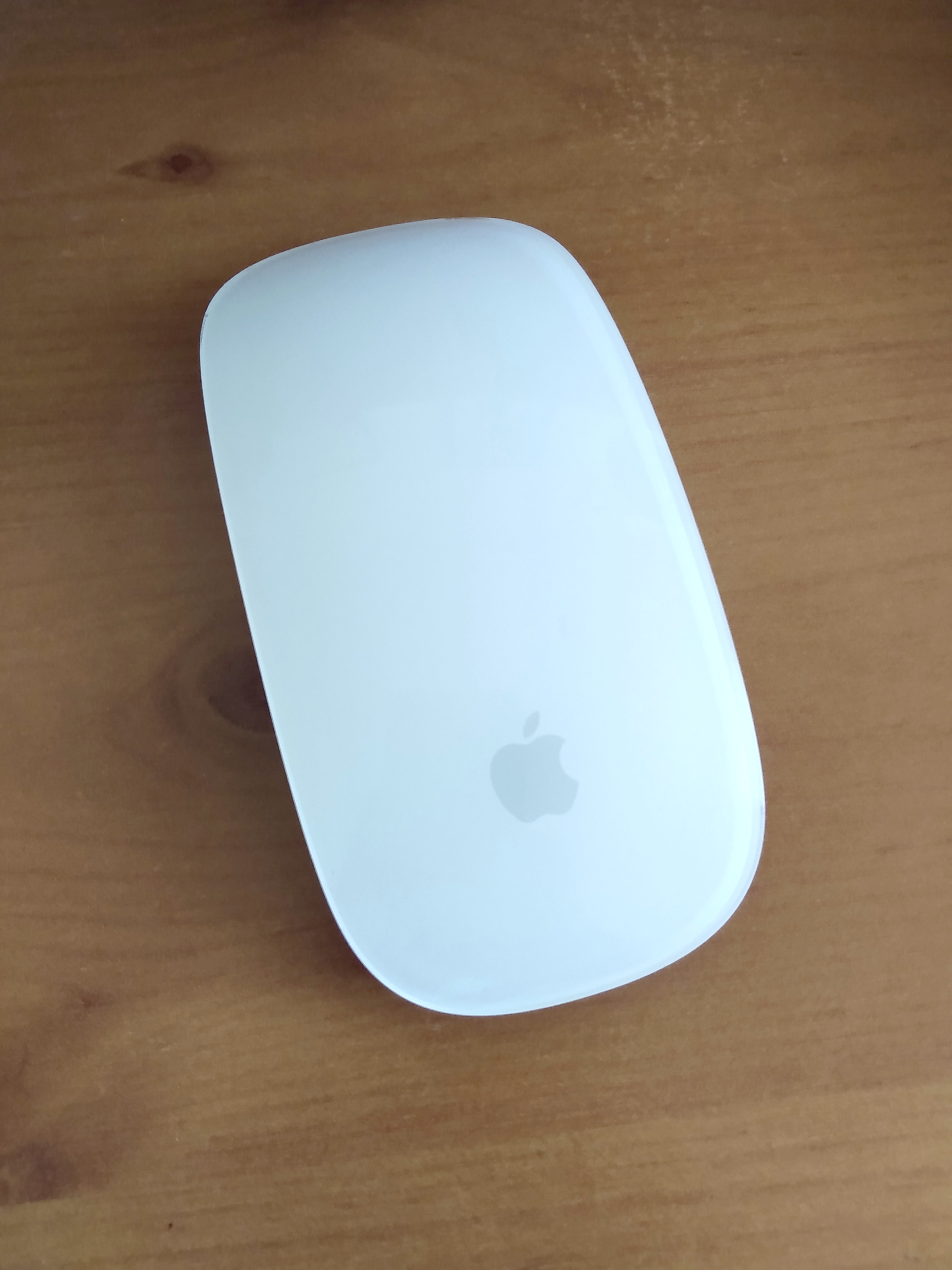 You're beautiful but I can't work with you.
One of my favourite books for thinking about the topic of interface design is the classic The Design of Everyday Things. I try to set aside time every few years for a re-read, and each time I get something new from it. It's assigned reading for Industrial Design students, and with good reason. It dissects why we might find it easy - or difficult - to interact with our environments and to use the everyday tools that surround us. It is wonderfully scathing in showing examples of dodgy design and makes the reader into a keener observer of the good and bad design choices all around them. You'll never look at a door handle in the same way again.
Disenchanted
I was given an Apple Magic Mouse to go with the Mac I was using at the time. It looks great, right? So sleek, like something from a science-fiction film. The only trouble was, I hated it. I tried to work with the Magic Mouse for a while, but I just didn't take to it. It didn't feel right in my hand and I never got used to the buttons. A bit embarrassed, I ended up returning to my boring, well-worn old mouse.
 Back to old faithful.
So why didn't the Magic Mouse work for me? I realised why as I read through the Design of Everyday Things. It explains,
"The human mind is exqusitely tailored to make sense of the world. Give it the slightest clue and off it goes, providing explanation, rationalization, understanding. Consider the objects, books, radios, kitchen appliances, office machines and light switches that make up our everyday lives. Well-designed objects are easy to interpret and understand. They contain visible clues to their operation. Poorly designed objects can be difficult and frustrating to use. They provide no clues. Or sometimes, false clues."
There are no visible buttons on the Magic Mouse and no wheel for scrolling. Like a door without an obvious handle, it relies on your previous experience of using a mouse to make sense of it. You have to map what you know about mouse buttons and scrolling onto its blank surface, in order to use it. I didn't enjoy this, and I also missed the tactile feedback that I used to get from scrolling the mousewheel. It turns out that's quite important to me, especially when working on graphic design or video editing. I'm not ashamed to have returned to my dull old device, with its comfortable size, obvious buttons and nineties-era scroll wheel. Those features are what helped me to use it easily.
Apple and Design
Apple has a long history of being concerned with good design. They are famous for their focus on usability. This talk at an Apple Developer conference by expert Mike Stern is a great example of the kind of solid thinking they usually do in these areas. I often return to it when thinking about user interface design and making apps more accessible.
So they understand the problem. But the company seems to have lost its way a little bit when it comes to hardware. You may recall the controversy when it decided to get rid of the headphone jack on the iPhone 7. I still carry around a headphone adapter so that I can use my favourite (non-Apple) headphones with my iPhone, and things may now have started to swing back in the other direction. And then of course there's the Magic Mouse. I'm not the first person to dislike it.
A common thread in these hardware choices is that they tend to be done for what seem to be aesthetic reasons. The desire to simplify the physical appearance of the hardware to make it look beautifully minimalistic has won out over functionality. Why is that?
To understand this drive to simplify helpful features away, it might be useful to learn a bit more about the history of architecture.
Minimalism
You'll have heard of minimalism. These days it's code for throwing out all your stuff so you can live more simply, but it became a powerful force in modern architecture and design in the early twentieth century.
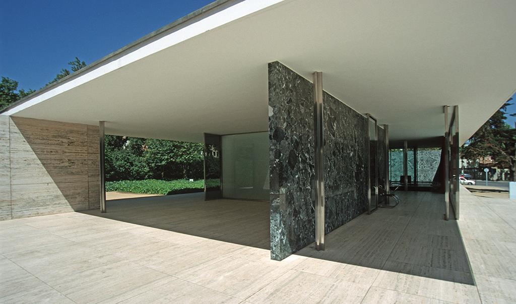 By Hans Peter Schaefer - Own work, CC BY-SA 3.0, https://commons.wikimedia.org/w/index.php?curid=52728
Here is an influential example - Ludwig Mies van der Rohe's German Pavilion for the 1929 International Exposition in Barcelona. With stark planes of gleaming glass and marble, it exemplifies his design philosophy of 'less is more' and stands in sharp contrast to the lush ornamentation, colour and decoration in the structures of other architects. It looks relatively unremarkable to modern eyes but at the time it was a shocking departure from accepted norms.
Mies pioneered the principle of the 'free facade', now used widely in modern office buildings. Basically, the interior walls no longer needed to do the work of supporting the roof, the support function being transferred to unobtrusive supporting stilts. The walls appear to float or to be made of glass, and they disappeared to give huge open-plan interior spaces. It disconcerted visitors. People were unable to 'read' the building using their existing knowledge of architecture, because it deliberately hid its functionality. It felt as if the roof might fall down and crush them.
Another way
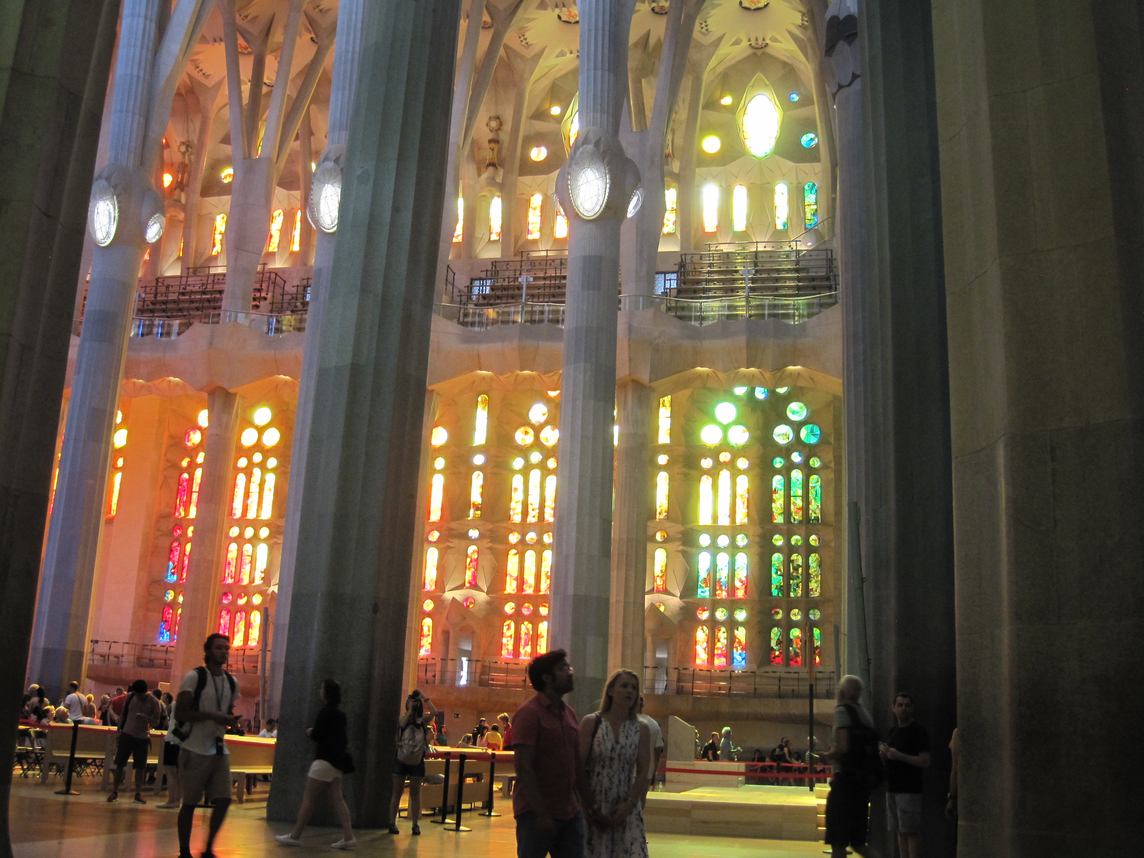 One of my favourite places in the world, La Sagrada Familia. My own photo, CC-BY SA 3.0 if you'd like to use it.
Another architect working around the same time was Antoni Gaudí. His creations also surprised conventional society, but for different reasons. His designs did not hide support structures or place them in unexpected locations, but worked with the limitations of existing materials in ways that were visible and obvious. Large glass panes strong enough to support a wall or be used as a door were impossible at that time, so Gaudí used doors fragmented by organic shapes in metal resembling the structure of a leaf or spider web. Some saw his work as ugly, complaining that he had made buildings look grotesque, half-melted, like insects, and so on.
Gaudí did not separate interior and exterior with hard planes but intertwined them, deliberately echoing the structure of a forest and with some of the same advantages. His buildings still don't need much air conditioning even in a hot Barcelona summer because of the way they are designed to let air to flow through them, using decorative shutters to shade the rooms. He was ahead of his time in looking for these solutions inspired by nature.
I think you can tell which one I prefer. But Gaudí's way of building did not win. It's rare to find a modern office block without a free facade, and especially rare to work somewhere that isn't open plan.
No room for mistakes or adjustment
To build something designed by Mies and his modernist successors requires painstaking attention to detail.
Charles Jencks, in his 'The Problem of Mies' essay points out
"There is no place for a mistake in his absolute universe, because extreme simplicity makes one hypersensitive to each inch of a structure and the Platonic form, with its transcendental pretension, demands utter perfection."
Later adjustments are very difficult. The outward strength and modernity of these glass-fronted buildings is undermined by how delicate they can actually be.
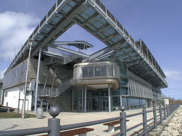 By Simon Letouze - Own work, CC BY-SA 3.0, https://commons.wikimedia.org/wiki/File:NGC_006_ngc_front_facia_reduced.jpg
People get angry when they realise that despite their looks, modern buildings can be more expensive to maintain than traditionally-constructed ones. The National Glass Centre in Sunderland is a tragic example. From the BBC:
"A spokesman for the University of Sunderland said it had commissioned a "full, up-to-date, independent building survey" in 2022, where external specialists concluded that a multimillion-pound investment would be required to address the longstanding problems with the building."
It is particularly painful that the seamless-looking design of the National Glass Centre, with its modern planes of steel and sheets of glass, is exactly what makes it so difficult to care for. It shone when it was new, but now it looks unlikely to outlive its architect. It will apparently be cheaper to tear it down and rebuild entirely than to fix it.
A Pattern Language
This brings us - rather neatly - back to programming.
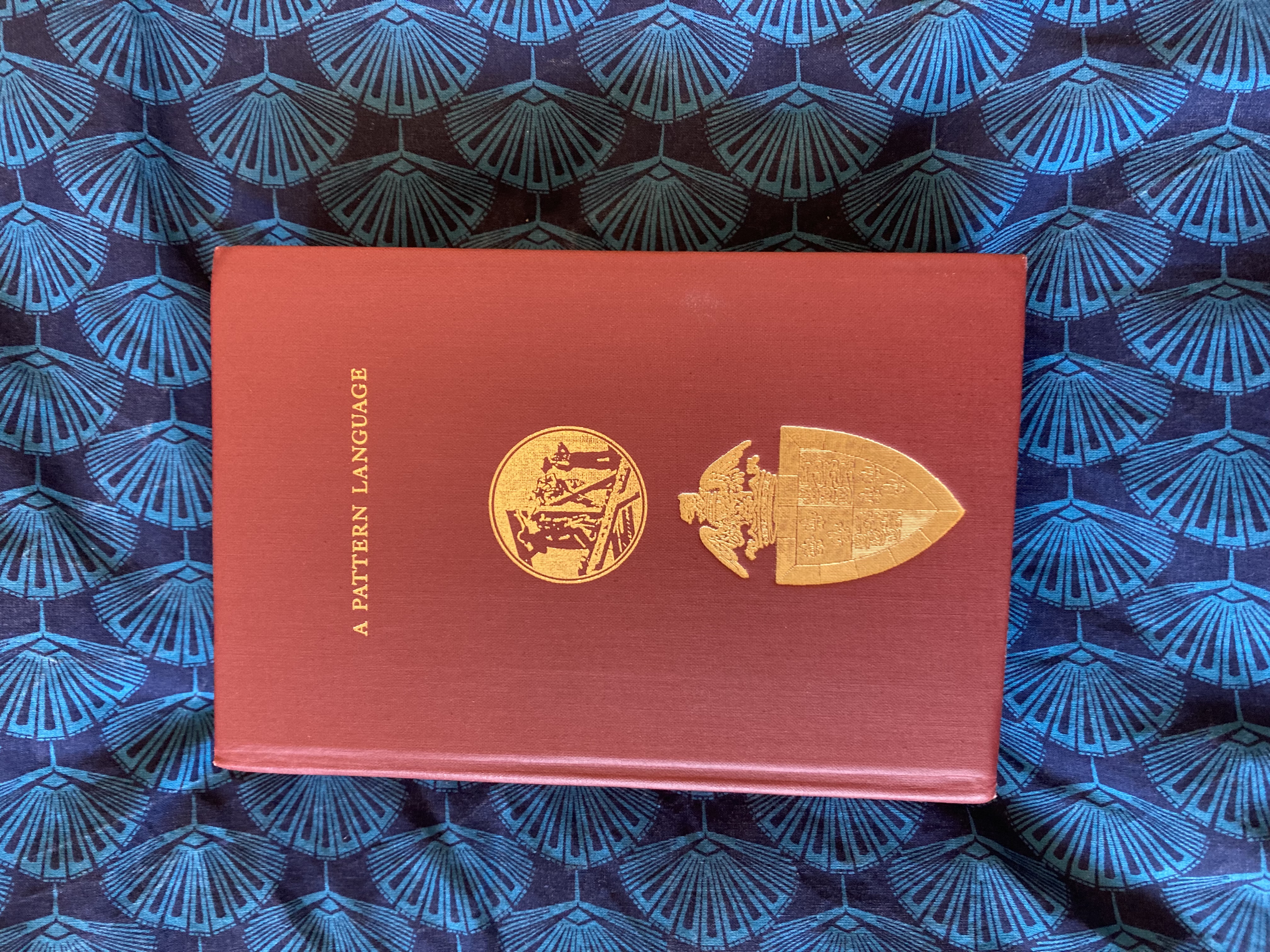 The first book I would save from a house fire
This is my copy of 'A Pattern Language' by Chistopher Alexander, Sara Ishikawa, Murray Silverstein, Max Jacobson, Ingrid Fiksdahl-King and Shlomo Angel. It's part of a series of books on planning and architecture written by their group in Berkeley in the 1970s. It lays out in very practical terms ways to design pleasing spaces. It has recipes for everything from the very large town planning level all the way down to what height you might place a windowsill to give a comfortable window seat. I love it dearly. I have used its suggestions in my daily life and enjoyed the results, and when as a teen I dreamed of becoming an architect the Berkeley group were the ones who I looked up to.
Their ideas have had unexpected resonance in the programming world.
When Object-Oriented programming was emerging as an interesting new way to design systems, Alexander was invited to speak at the OOPSLA (Object-Oriented Programs, Systems, Languages and Applications) conference in 1996.On the podium he looks slightly bewildered and comments,
"I'm addressing a room - a football field! - full of people, and I'm afraid I don't know hardly anything about what all of you do... My association with you, if you want to call it that, began about two or three years ago when a computer scientist called me and said there were a group of people here in Silicon Valley that would pay $3000 to have dinner with me. I thought, what the hell is this!"
He was greeted by programmers very enthusiastic to talk with him about 'design patterns' in software. Richard Gabriel, then working at IBM, was one of the first software engineers to draw links between the architecture of buildings and the design of code. His thoughtful book Patterns of Software: Tales from the Software Community was later published with a foreword by Alexander. Gabriel suggests we:
"find good designers - know them by their works - and study what they do"
This led later down the line to things like the Software Craftsmanship movement and op-eds like this one by Freeman Dyson extolling the union of hand and mind in making useful things. People in software had woken up to the reality that they were practicing a craft, something that was half-art and relied on skills passed down from masters to journeymen.
Why are some programmers interested in architecture? Perhaps we're working on the same problems as architects: making complex systems that people have to live with (and inside of) and adapt in the future.
We must make design choices that won't bewilder users, so that our creations can be navigated easily. Another shared problem is to work out how to make things that can be maintained over time. Systems that appear perfect and beautifully minimal can fall apart if they're constructed in the wrong way. It is usually better to make something messy with the marks of hand-crafting, something adaptable, rather than aim for outward perfection.
There turns out to be a pretty big overlap between architecture (and its problems) and software engineering (and its problems). It makes reading books from each discipline alongside each other a delight.
When I ran across these ideas in the software world years later they struck a chord of memory in me. I was very amused to find that the holy grail of certain programming greats was a book I already had on the shelf in my study for entirely different reasons. It made me feel at home in software.
So, goodbye Magic Mouse. But thanks for taking me on an lovely tour of my design and architecture bookshelf! Drop me an email if you disagree with me - does the Magic Mouse actually work for you? Have you also been influenced by A Pattern Language?